
45 rocket launchers
350+ satellites operators
30+ international partners
Product Desktop
Helping the aerospace match-making solution take off.
Freelancing — April 2022
45 rocket launchers
350+ satellites operators
30+ international partners
Product Desktop
Freelancing — April 2022
Ride! is a Paris-based New Space scale-up that connects satellite operators and launch vehicles or OTVs (Orbital Test Vehicles).
Based on precise criteria such as the desired orbit, launch date, weight and dimensions of the satellite, Ride! performs match-making to facilitate contacts and contract negotiations between market players.
Ride! is backed by a number of market players, starting with ESA (the European Space Agency) & CNES (the National Centre for Space Studies).
Ride! lacked a "Product" vision for its SaaS solution. They had started to develop a first draft but were stuck. they needed an MVP to launch their fund-raising campaign.
Ride! had to offer a 'universal' tool, even though its customers and prospects came from diverse backgrounds and had very different expectations. Some of which even conflicted with the founders' vision.
Cultural differences had to be taken into account, since Indian, Chinese, French and American customers were involved. They also had very different degrees of business maturity (from established launchers like Ariane to newcomers in SpaceTech like Agnikul).
In addition, some people saw the product as a possible project management tool, which went beyond the scope initially intended by the founders. In the end, the notion of 'project tracking' with a highly granular, filterable view was added to the roadmap along the way.
To make it even more challenging, Ride! had to present a functional MVP to investors 3 months after I started working on the assignment.
We were thus able to draw up a list of needs, expectations and information required by the various launchers in order to make a decision. We also noted their expectations regarding Ride!'s role and support in the process of bringing them together.
Alongside their CTO, Lucien, I conducted interviews with potential customers from India, China, USA & France so we could gather some informations about what they were expecting from a tool like Ride! and how it could solve actual issues in their business.
We had two rounds of those: the first one was more open questions so they can freely answer and give us fresh ideas. The second one was based on the idea the founders had in mind, to make sure their vision was fitted to the market.
We gathered data about their expectations regarding both the support and the solution offered by Ride! The profiles of these stakeholders were quite diverse, both culturally and in terms of the maturity of their companies, although Ride! particularly targeted “new players” - launchers preparing for their first flight.
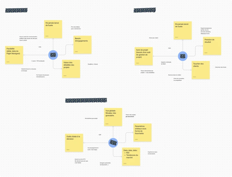
For instance, the two Indian launchers saw Ride! as a potential project management tool, which went beyond the scope initially planned by the founders. When a third player expressed this notion of “project tracking” with a filterable, highly granular view, we decided this idea really needed to be discussed with the founders.
After that, I went to Paris, on their premises, to share our insights & get a clearer view of Ride’s founders’ business objectives.
Since we only had one day, I went for a mash-up of asking A LOT of questions to understand the product at best and running different workshops over the day:
After taking the time to further immerse myself in the specifics of SpaceTech and the professions of both rocket launchers and satellite operators, I asked the founders to adopt the vision of their customers.
Using the intel gathered during preliminary interviews with various prospects, I had them compare their expectations and business needs with those of their targets.
This way, we were able to break out of the “we need *this* for our match-making algorithm” mindset and focus more deeply on the metrics that actually matter to the users.
Once we had found the ideal compromise between Ride!'s business needs and the functional expectations of their targets, we reviewed the information retained from various interviews and drew up cognitive maps. We also proceeded to prioritize the needs and desires of the various potential customers.
This gave us a clearer picture of the primary and secondary needs Ride! had to meet to attract its target. We were also able to clarify what Ride! needed to operate.
Then, all together, we tackled the most important stage of the workshop: the design workshop.
Using the mind maps as a starting point, we listed, sorted and prioritized all the information and functionalities we wanted to offer. We were then able to distribute them across the different screens of the application and map out the scope of v1 of their software.
It was on this basis that I was able to work on the wireframes for the app's various screens.
The goal was to propose a simple interface where the amount of information required would not be suffocating for the user. By prioritizing themes and needs, I was able to quickly go through iterative zoning and wireframing phases.
The “cockpit”, the screen presenting the various projects likely to be of interest to the launcher, logically saw the proposed projects brought to the fore, while the declined or lost projects were relegated to the bottom of the page. The choice was made to have the “in progress” projects on the side to dissociate them from the others, while leaving them quickly accessible.
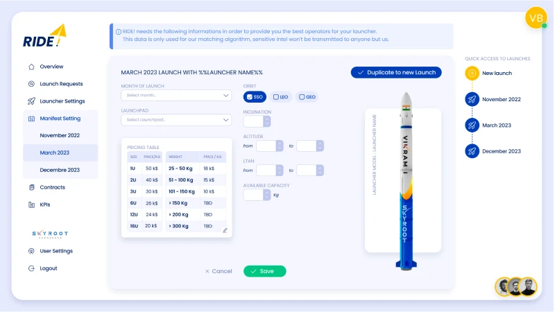
The launcher configuration (the type of rocket) and launch configuration (each flight) screens were a little more debatable, given the number of fields to be integrated. We initially opted for a “profile”-type layout with fields editable on the fly, to get away from the indigestible “form” look.
One idea, which was finally dropped, was to use a slide-in panel to edit flight information from the launcher's configuration screen, since each flight is largely based on the information entered in the launcher.
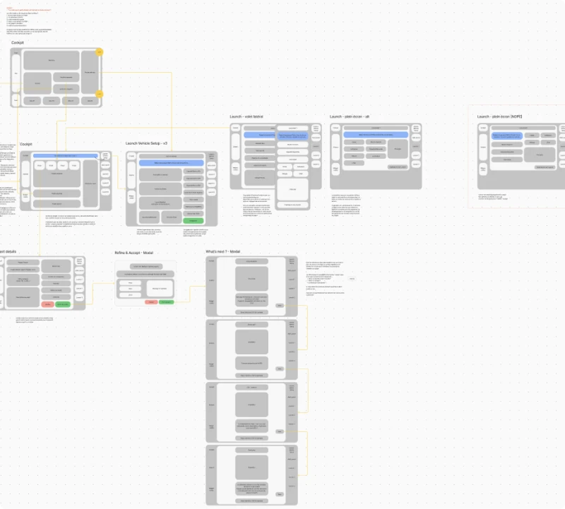
As the application's tree structure was quite simple, I decided to ditch the classic menu. The “cockpit” was accessible via a fixed button at the top left, and the user's launches via the right-hand sidebar, with its quick access to settings and different launches.
I drew my inspiration from what's done on social networks, where the sidebar spaces are used to display fixed “sidebars”.
To populate the one on the right, I decided to integrate the dataviz and a space weather widget, two things we'd talked about in the UX workshop as bonuses.
When we were confident we were going in the right direction, I jumped into UI and interactive prototype so the dev team can be as autonomous as possible to build the actual MVP.
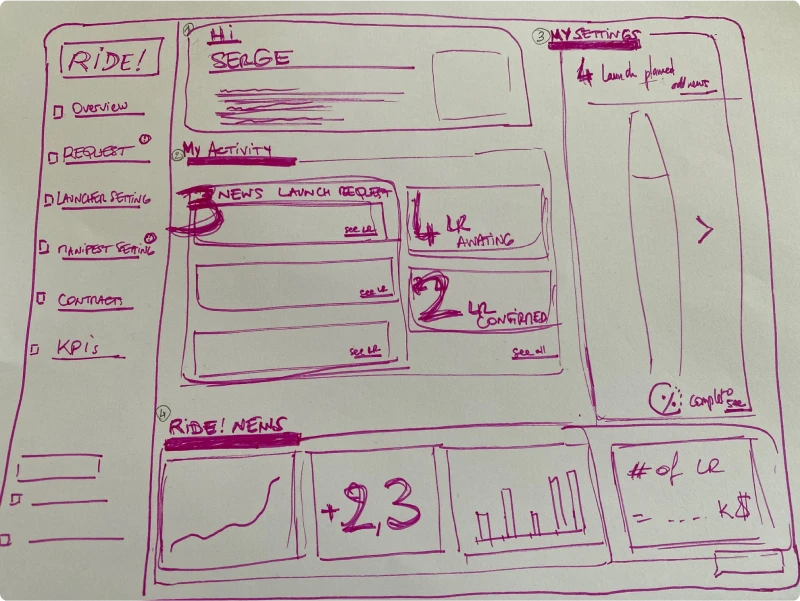
Logically enough, my first draft followed the wireframes almost to the letter.
But I soon realized that things weren't quite right... Even though the design wasn't fully polished, the navigation was ultimately unclear, with information or alert messages not sufficiently identified with their placement in what ultimately looked like an empty menu bar.
The readability of the dashboard also needed to be reviewed: suggested projects were not sufficiently differentiated from those rejected or lost, nor from those in progress. The result was too much similar information.
The dataviz made the whole thing even more difficult to read.
Not to waste any time, I asked Lucien if we could conduct new user interviews with various potential customers. Which we did, showing them the screens of this v1 and gathering their feedback. For some interviewees, we opted for a fairly directive approach, explaining the screens and possible interactions. For others, we just showed them the screen and let them “guess” and observe how they would interact.
Now that we had those feedbacks, we were able to redefine where we wanted to go.
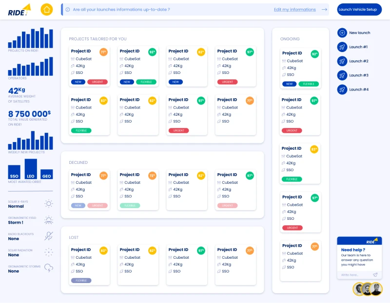
The first major change was to add a real home screen to the application. There was a lot of feedback about the fact that the user felt thrown into a complex screen.
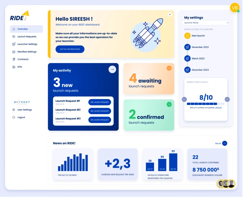
We therefore created this “overview” page, which serves as a summary of the different sections of the application (access to projects, quick access to settings and to the creation of a new launch...).
The dataviz has been integrated into this home screen, freeing up space on the left for a menu that had become a necessity, and providing the cues users expect.
The screen presenting projects has also been simplified: proposed projects are now on a single line, and can be filtered to meet the need for granularity expressed by different potential customers.

Accepted/validated projects have been moved from their sidebar to appear just below. The information displayed on these projects makes it possible to track the progress of collaboration between launchers and operators.
Finally, lost and declined projects have been merged into a single section, in a more compact table format.
The launcher and flight configuration screens, meanwhile, have retained much of their original form.
‘Contracts’ and ‘KPIs’ entries have been added for a v2 version of the application, still with a view to providing users with enhanced project follow-up.
I came up with a clear and intuitive interface despite the amount of data necessary for match-making and customer decision-making that has to be displayed on the app's various screens.
In the end, I was able to get the founders of Ride! to adopt their customers' point of view without them denying their project and its ambition. The user interviews allowed us to compare the founders’ expectations and their business aspirations with the reality of the market. We were therefore able to focus on the real needs of their targets.
In less than a month, user interviews, UX workshops with the team, wireframes and pixel-perfect interactive mock-ups were completed. The developers were able to deliver their MVP in time for the investor round.