Libre & Open Source
11 releases so far
200+ users on 10+ instances
UX/UI PWA
Crafting an ethical & decentralized social network platform.
Personal project — since 2021
Libre & Open Source
11 releases so far
200+ users on 10+ instances
UX/UI PWA
Personal project — since 2021
Mangane means "rogue" in Bordeluche (the Bordeaux dialect).
It's the name we've given to the software that runs our local (but open to the rest of the world) social network, without advertising or the commercialisation of personal data.
Clovis, the dev behind the project, asked for my help to improve the experience offered to BDX.town users.
We were starting from an existing graphical and functional base, but we both wanted to go further and offer features that weren't there before, to make it easier to get to grips with and adopt this decentralised network.
We want this microblogging platform to be a place for local artists, makers, creators and craftspeople from Bordeaux and the surrounding area to interact, confront ideas and help each other.
Some users were already familiar with the Fediverse, the concept of federation between different servers and what this way of doing things implied for the people joining. But newcomers were often kinda lost with all the differences with a centralized product, own by one entity, where you don’t have that much choice and everyone is at the same place.
So, in order to make Mangane really open to as many folks as possible, we came to the conclusion we needed to give people the tools to enter this new realm instead of letting them figure every thing on their own..
First, we decided to onboard people and guide them through their first steps. We just needed to make it as concise as possible not to overflow people with information.
At that time, only Mastodon ever proposed some kind of onboarding. And they even dropped it the year prior, in 2020, in favor of an email that recaps some useful knowledge and links to some settings and presets.
So… benchmark went pretty quick, even though i managed to put my hand on said onboarding thanks to an outdated instance 😅
![]()
While it was there though, the onboarding modal was introducing instances and how they can interact with each others, and the several feeds that were available to the user.
Questions remain though: do we really need to remind people the name and URL of the server they just joined? Do they really already know how to like, share or interact with another post they stumble upon?
Based on what we observed, and feedback we gathered for a few weeks, I listed every topic we coud address in our onboarding — based on Mastodon’s but also concepts we saw people weren’t really grasping — before ordering them by importance.
We ended up with that list:
✅ Required
👍 Interesting
❓ Optional
Not to have a too long onboarding, my proposal went with 4 steps:
I ended up with an additional step (step 1 was divided in 2 cause it had more info than I first thought) but apart from that, everything went according to plan!
![]()
I also suggested that, rather than taking the user to an empty home timeline, we’d show them the local one, with everyone from the same server so they can dive straight in the conversation.
The empty home feed would display a message explaining how to populate it, suggesting to follow people or hashtags.
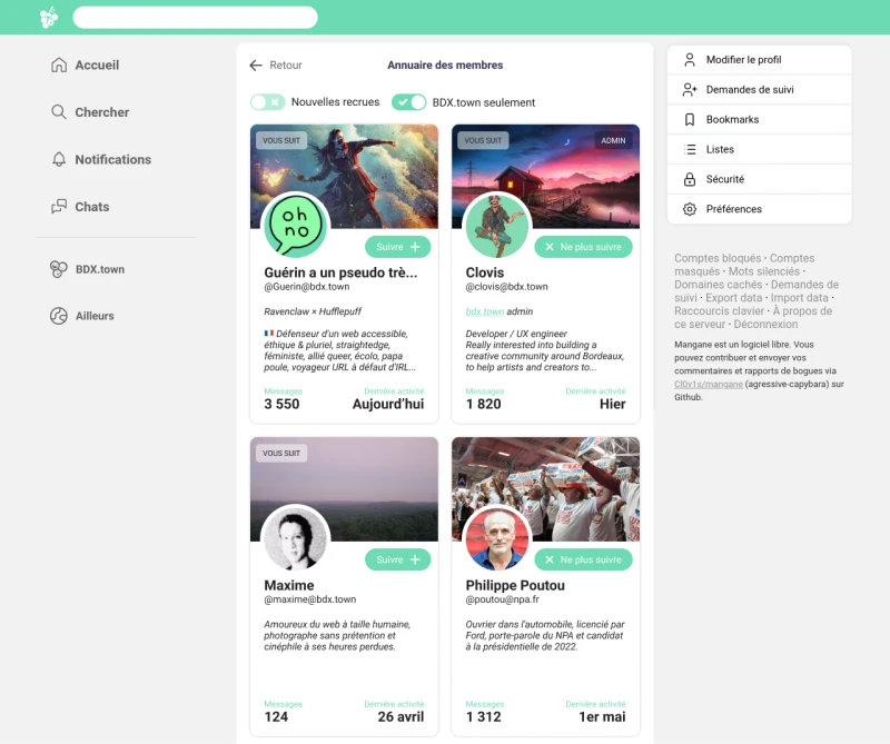
In addition to the onboarding, and still with the aim of helping people find other people to follow and interact. with, we wanted for Mangane to have a user directory.
Mastodon, and Misskey, two others fediverse softwares, were already offering those and we felt they could be pretty useful.
Before I even start working on that feature, my feeling was that the numbers of followings and followers shouldn’t be relevant data when it comes to follow someone. Those vanity metrics can only amplify social media addiction which is not our goal.
The poll I ran confirmed that people mostly don’t care for those (and for those who do, they’re often more interested in “smaller” accounts than big ones.)
![]()
On the other hand, the number of posts can be an indication — one can be looking for active profiles so their feed is always fresh, others might want to avoid the chatty ones. Even more when paired with an inscription date so we can get a frequency of publishing.
Ideally we’d only need that frequency, so users don’t have to do the the maths themselves. The only downside would be a user who’s been lurking for a while and suddenly starts posting a lot. They would display an inaccurate frequency for a while.
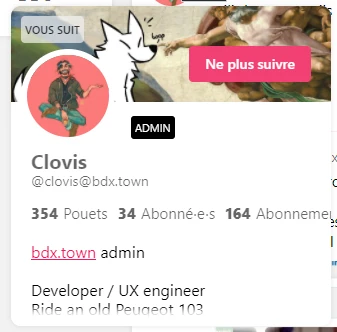
Before I even went and see how others were doing it, I wanted to go over how Mangane was already displaying profile cards at different places. Those would be used a refereces for the directory so we don’t need to code something from scratch that would feel out of place.


Mastodon
At first, Mastodon seems to display the same data (banner, profile picture, bio, number of posts & followers).
The software stands out by offering “last activity” data, which allows you to better gauge the ‘vitality’ of an account and avoid following a ghost profile…
![]()
It also allow to filter views (recently active, newcomers, local or federated profiles…)
Misskey
Misskey profile cards offers exactly the same informations than Mangane. Its directory offers “pin users” which is a hand-picked selection from the admins
![]()
In the light of these considerations, I started iterating on graphic solutions in order to find the most efficient and visually appealing one.
I used the default user card as a starting point and removed every data except number of posts and last activity.
![]()
I tried with a “online / offline” pill but i was redundant with last activity in addition to not being relevant to whether to follows someone or not.
![]()
Another path, a more virtuous one maybe, came to my mind: why not delete all data and rely only on people’s bio? A version stripped to the bare minimal, to really avoid the race for metrics and the snowball effect of “big” accounts getting even bigger.
![]()
I really liked it, and I even suggested it to Clovis…
but…
There's a hitch…
![]()
With users with a short bio.
Or no bio at all.
Now, the card now looks empty and poorly designed.
We considered a masonry display for the directory, so we could have variable height cards but we felt that readability was affected and sticked to a class fixed-height grid.
In the end the final pick was my first draft. The data at the bottom is not only reassuring to most users, it also give visual rhythm to the card. Guess sometimes you get it right the first time, but you don't realize it until you're experimenting with other ways. 😅

Both onboarding and user directory were warmly welcomed when released. With a growing number of newcomers, we've still seen a significant drop in posts asking for help.
Last year, we've introduced the ability to follow hashtags, as a new and better way to find new people to engage with. Therefore I recently ran a new poll to see if user directory was still used. As I was expecting it, only a minority of respondants actually use it nowadays.
Fun fact: half of respondants using another software than Mangane, didn't even know they had such a tool.
Over time, I've dedicated myself to improve Mangane, bit by bit. Since it's a personal project for both Clovis and I, things go slowly.
Anyway, we manage to implement a lot of things that upgrade the overall experience with our software:
![]()
We keep Mangane evolving as much as we can. Clovis is currently refactoring most of the code to clean it and make Mangane even more lightweight and sustainable.
I started working on a total rebranding, so we cut ties with the old-twitter look once and for all.
We started building a Design System for both Mangane and a minimalist blog provider, called Noircir.
![]()