0 fossil industry founded
+30k tons of CO₂ avoided or stored
4× less CO₂ than Top 3 french banks
UX/UI Mobile
Easing the process of modifying withdrawal limits in green neobank application.
Case Study — November 2020
0 fossil industry founded
+30k tons of CO₂ avoided or stored
4× less CO₂ than Top 3 french banks
UX/UI Mobile
Case Study — November 2020
As part of a recruitment process, I was asked to put forward my vision for the functionality for modifying withdrawal limits in the Green-Got neo-banking application and design the UI of said feature.
The aim of this case study was to provide a quick and simple experience for app users who wanted to change their withdrawal and/or payment limits.
At the time, Green-Got was not yet an operational bank open to the public. They were a new player in the FinTech industry, shortly preceded by Helios, which had announced its offer, with a similar market position a few months earlier.
Green-Got needed to reassure potential customers & come up with an app that lived up to expectations, and were recruiting their first designer to design it.
This being part of a recruitment process, I had to work to very tight deadlines (i had less than 24h to send my solution).
I immediately jump into research. I’m looking for any information that will give me a better grasp of the ins and outs of a banking application and the issues specific to the sector.
The (self-proclaimed) leader in new-banking, N26, is full of praise for its approach, but doesn't go into too much detail about the design process.
The most talkative are the members of the UXDA agency, which specialises squarely in the design of banking and FinTech apps.
A number of designers in Brazil, Russia and even Bangladesh share their work in various articles.OK I think I see where I’m going. Now time to get some inspiration both visually or structurally. I now have a clearer idea of what a banking app need and what I’d like for it to propose.
A quick trip to Behance for ‘realistic’, detailed interfaces (some designers have created hundreds of different screens for the same application).
A stop at Dribbble, for visual pleasure, but not only: underneath the glossy graphics you can also find some great structural and technical ideas.
I'm starting to get a clearer idea of the most important elements in a banking app. And those that I think will improve the user experience and add value to Green-Got. Features that I'd like to have myself as a user (even though I know we're not our users^^). The ones that should be the most accessible or the quickest to activate.
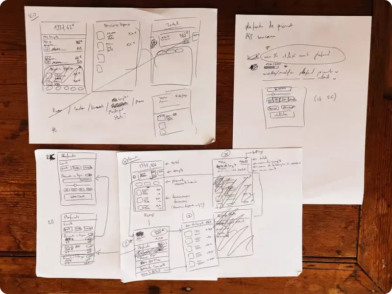
I put my first drafts on paper so that I can quickly and easily iterate, adjust and start again.

I end up with a fairly clear vision of what I want on each of the screens that the user-ice.ice will go through to perform the limits & caps management action.
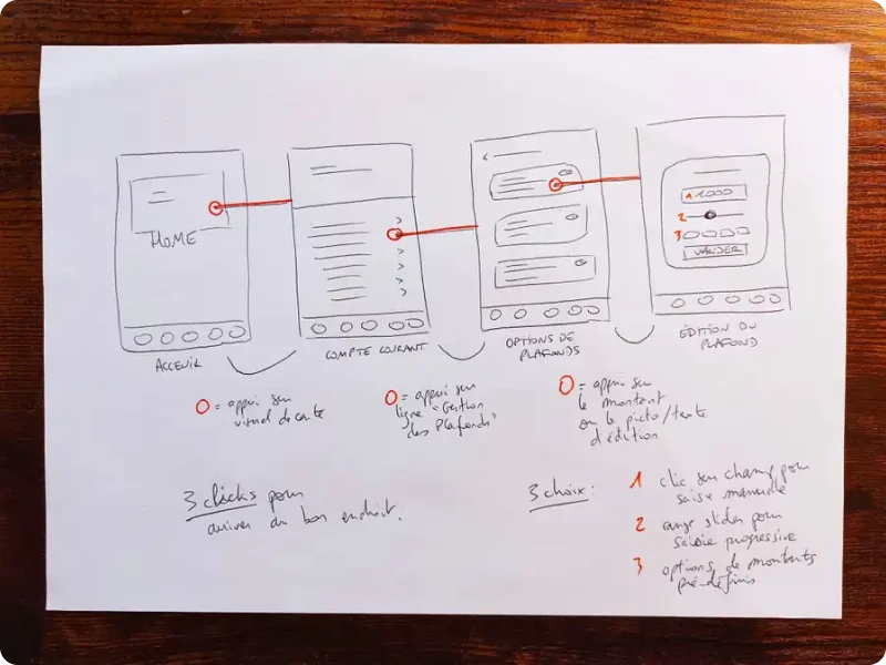
Let's talk about these screens: I wanted to limit — as far as possible — the number of interactions needed to get to the desired screen.
I (literally) draw different user-flows until I've achieved a fairly succinct path. In 3 steps you're on the screen where you set the amount of the selected limit. one that allows the user to get to the requested feature in less than 3 steps from the home.

Now that everything is settled on paper, the wireframes and UI stages have gone off smoothly.
Only the detailed account view screen was reworked twice before returning to the starting point. I initially wanted to have the banking operations (both revenues and expenses) on that second step BUT it was redundant with the home screen that already presented an aggregated view of all accounts.
It felt like, on the user’s perspective, that you were entering a new room... except half the furniture was almost identical, potentially misleading you.
So I went back to my first, simpler draft: a list of common actions associated with account management. In terms of integration, this solution has the advantage of making it easier to add new functions, as they are simply listed one after another. The structure of the app does not need to be reviewed and corrected for each new implementation.
![]()
I've opted for a triple-entry system for modifying this value:
After adjusting the various elements I wanted to see on each of the screens encountered by the user when managing the ceilings, it was time to "decorate"!
Obivously I tried to stick as closely as possible to the mock-ups on the Green-Got website at the time, so as to create a coherent & elegant, modern & uncluttered whole.
While the interface has to be pleasant to look at and use, I'm fully aware of the pitfall of unrealistic design. (A lot of shots on dribbble use brand logos to illustrate payments, the feasibility seemed to me, at best, far too complex compared to the gain in quality of experience).
![]()
I've opted for minimalist icons to categorise the different money movements: this makes for a less austere interface and keeps things technically realistic (I realized afterwards that the icons might better be in different shades though, so the categorisation is easier to read for the user).
I've added a few animations on Xd to help convey my vision of the transitions between screens for instance.
I considered several performance indicators in order to assess the efficiency of the solution I proposed and its implementation:
Ideally, feedback requests could be pushed into the app, for example when the feature is first used, so that users can review their experience.
FRC.Bank: UX Case Study. by Archetype Agency
UX Case Study: The Most Beautiful and Awarded Banking App Design
A new experience of daily mobile banking — a UX case study
UX Case Study: How to Create a Mobile Banking Super App
Banking App — UX Case Study and Design | by Awesome Sid
Building a personal financial app — a UX case study
UX Case Study: Mobile Banking Apps | by Dan Ryland